Razakar

UX / Summers 2022

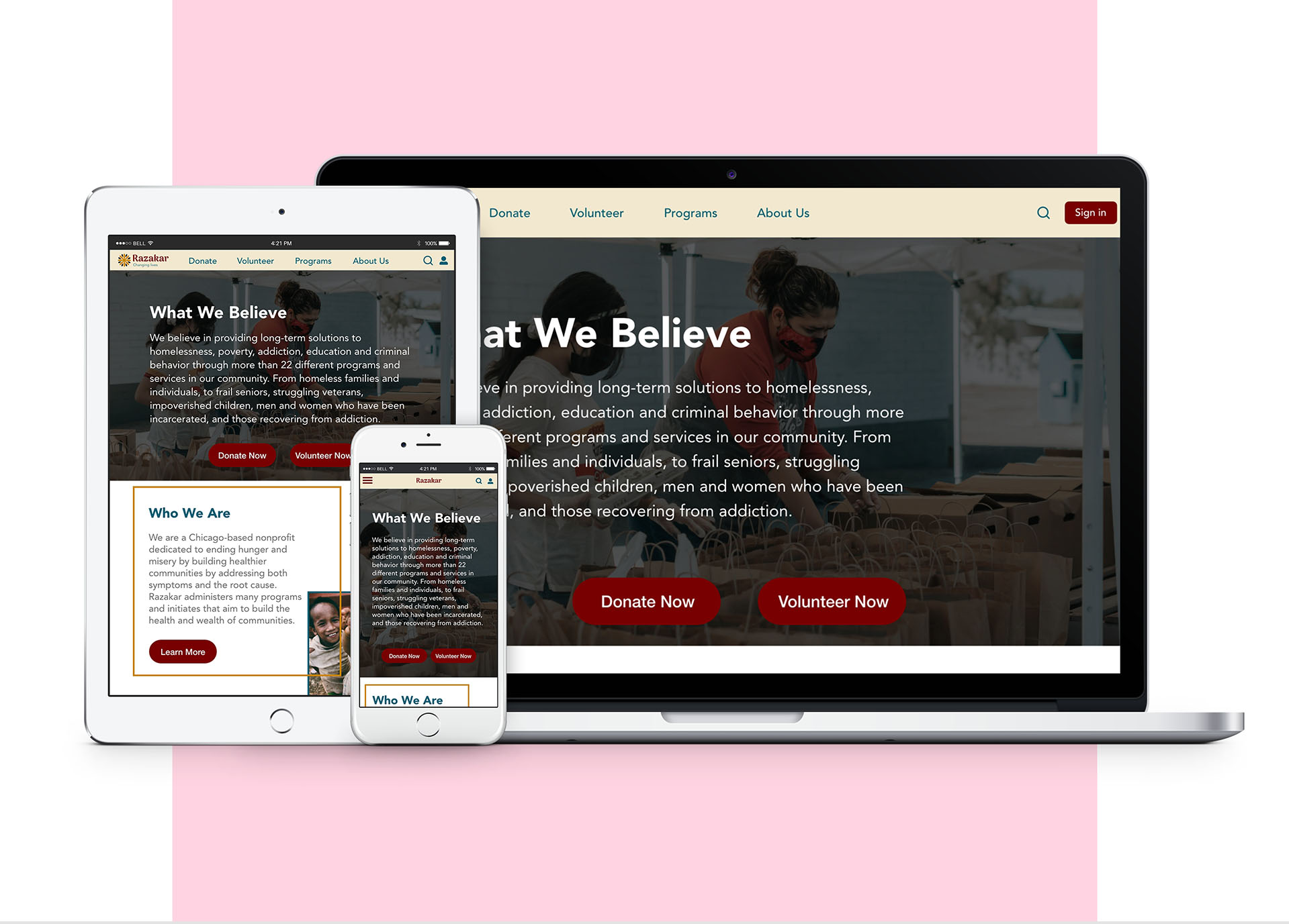
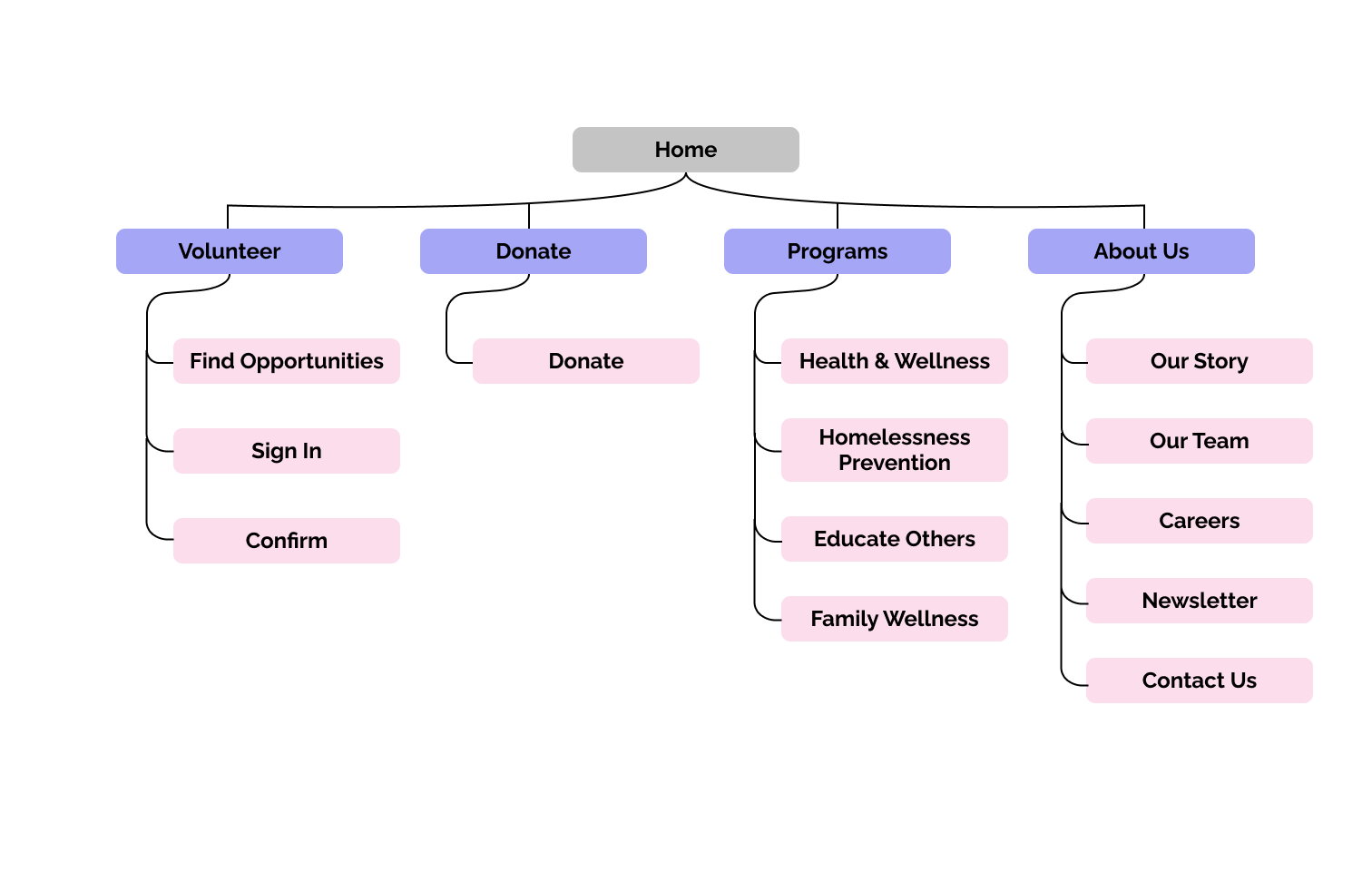
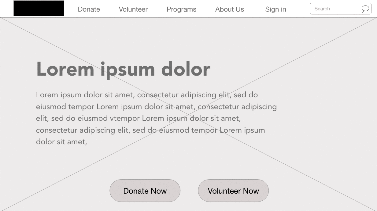
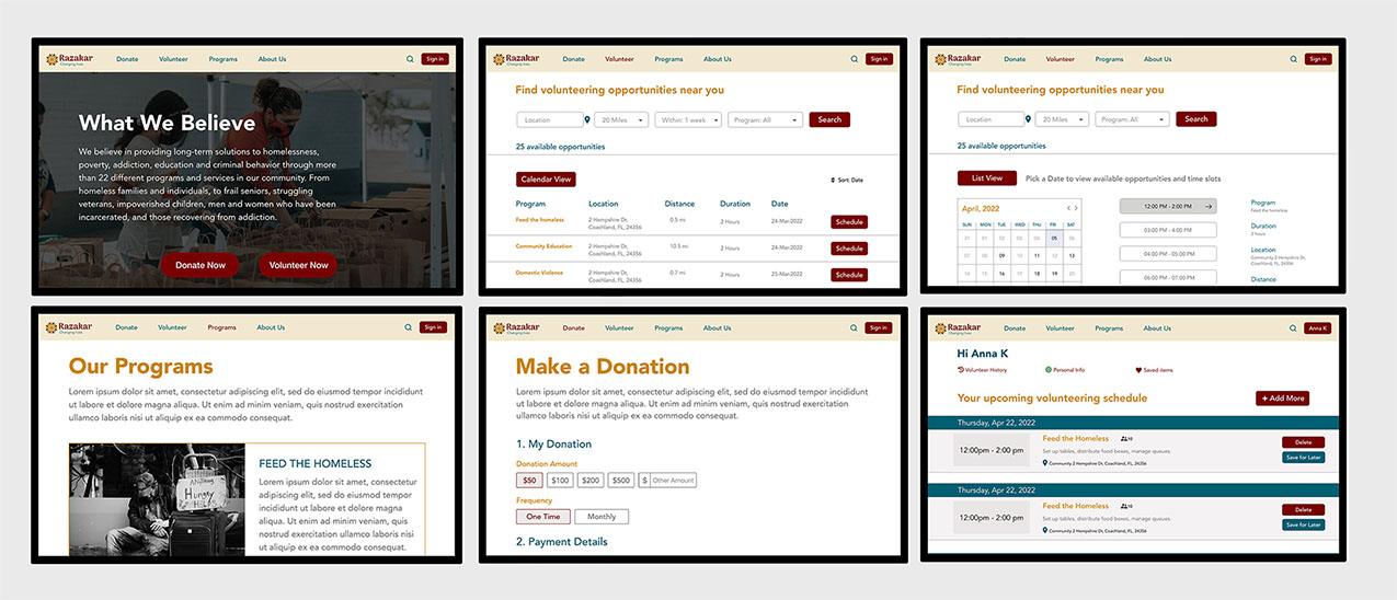
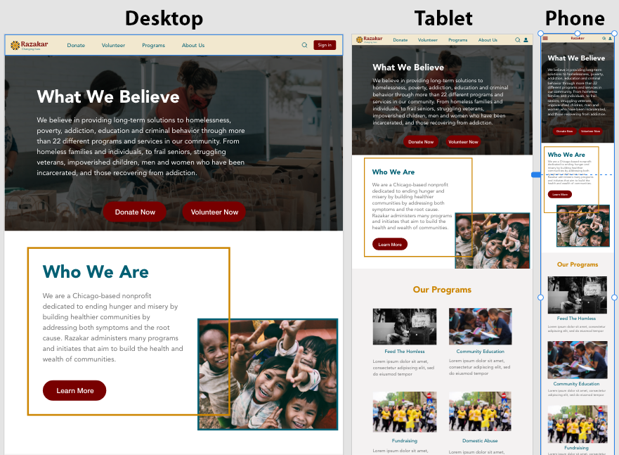
Role: I was responsible for designing a responsive design for a humanitarian cause through conducting interviews, paper and digital wireframing, low and high-fidelity prototyping, conducting usability studies, accounting for accessibility, and iterating on responsive designs.
Duration: 12 weeks

Razakar volunteering app mockup
Tools used: Adobe XD, Photoshop, pen and paper, Human brain.

The Goal


Design a user-friendly volunteering website by enabling the user to choose the desired time and location in advance. .


Target Audience:


Users are from all age groups and walks of life

The Problem


Available volunteering websites do not offer an option to choose a desired time and duration for volunteering opportunities. Also, it does not offer a filtering option for time slots and locations.

Pain Points

___________________________________


Process

Volunteering schedule is not available in advance.

Time

Lengthy sign-up processes and forms.

Process

No flexibility in choosing desired working hours.

Product

Volunteering options are hard to find.

User Research

___________________________________

I conducted user interviews, which I turned into empathy maps to better understand the target users and their needs. I discovered that many target users visit volunteering websites to look for an opportunity in their location with specific available hours to spend from their busy schedules. Most volunteering websites do not provide the schedule way in advance.

Also, they mostly do not offer flexible hours and expect you to spend a fixed number of hours which makes it difficult for the users. It causes frustration for the users as they want to contribute to a noble cause but they cannot.

Persona


Sam

“Being in service to others is what brings true happiness”


Age: 20
Education: High School
Hometown: Allentown, PA
Family: Lives alone
Occupation: Student
Sam is a student completing his college degree and living in a hostel. He takes classes and does group studies with his class fellows. He wants to do volunteer work, but he has limited hours between his classes and on the weekend. He doesn't have a car so he prefers to volunteer in places accessible by a bus.

Initial Design Concepts


Confusing website navigation was a primary pain point for users, so I used that knowledge to create a sitemap.

My goal here was to make the volunteer opportunities easy to find and sign up for that would improve overall website navigation. The structure I chose was designed to make things simple and easy.

Sitemap

Low-fidelity Prototype

User Testing Results


I conducted two rounds of usability studies. Findings from the first study helped guide the designs from wireframes to mockups. The second study used a high-fidelity prototype and revealed what aspects of the mockups needed refining.

Round 1 findings

  1. Users weren’t sure where to find the volunteering opportunities
  2. It was not clear that the user needed to sign in first before seeing the available volunteering opportunities.

Round 2 findings

  1. On the volunteering opportunities page users were confused about the function of the Learn More button
  2. There was no option to go back to the previous page

Mockups

___________________________________

Based on the insights from the usability study, I made changes to improve the site’s volunteer sign-up flow. One of the changes I made was to display volunteering opportunities on the main volunteer page. This allowed users more freedom to view the opportunities in advance before signing up for one.
To make the volunteer sign-up process easier I have included the list view button on the calendar view page so that the user can switch between the calendar and list view easily.

Razakar Casestudy

Responsive Mockups

Truffles project

Conclusion


I've learned that even a small design change can have a huge impact on the user experience. The most important takeaway for me is to always focus on the real needs of the user when coming up with design ideas and solutions.


Next Steps

  1. Conduct follow-up usability testing on the new website
  2. Identify any additional areas of need and ideate on new features
  3. Test the app for better accessibility by improving alt text, negative space and heading tags