Internal Linking for Better User Experience


Internal links help users navigate your website to find the information they’re looking for. Creating an effective internal linking strategy is crucial to improve user experience and SEO (search engine optimization) which determines your website's ranking on the search engine. Here’s everything you need to know about the role of internal links for a better user experience.

Internal links are important for a better user experience because they are a part of the website information architecture that establishes how well the website is connected for better and relevant information flow. It also helps a user to stay on the website longer and increases its credibility and search engine ranking which is crucial for achieving the business goal to convert maximum traffic.

Type of Hyperlinks

There are two types of links, internal and external, both types of links are crucial for the search visibility and ranking of your website. In this article, we will focus on internal links and the best user practices for internal linking to give users the best experience.

Internal vs External Links

In simple words, Internal links are hyperlinks that take a user to another page of your website while external links are hyperlinks that take a user to another website. Internal links keep the users on your website while external links take them out of your website onto another.

Best UX practices for Internal links

As user designers, we should follow the best internal linking practice to make it easy for the user to find the content they want to see. Users should be more focused on finding the content rather than finding a way to reach that content. To do so we can do the following things.

The most widely used internal links are the navigation page links which take the users to a different section of the same website. According to the statistics, 61.5% of visitors leave websites with lousy navigation. Lousy navigation decreases user engagement, gives a bad user experience, and discourages a user from spending more time on the website. The navigation should include links to the most important pages and use clear labels for the links. Dribble has good clear and engaging navigation.

Dribbble Desktop Navigation
Dribbble Mobile Navigation

Buttons for the Primary Call to Action Buttons


The second most important internal links are buttons that take users to other pages of your website to help them perform an action or complete an important task. To have a better user experience,

  1. Buttons should be visible so a user can easily find them.
  2. The button's size should be optimal and reflect if it is a primary or a secondary button. The primary button is always larger and more prominent.
  3. Button labels should be understandable and point users in a clear direction.
  4. Buttons must follow the WCAG 2 Contrast and Color Requirements.
Adobe XD - Button states

Link Similar, Related, or Famous Pages

When a user finds more useful strategically placed links on the webpage, they are likely to click on them thus spending more time on your website. Showing related or similar products, articles or videos are a few such examples. These links and products increase user engagement and satisfaction thus improving their overall experience and search engine rankings.


Zappos offering links to other products

There must be a way for a user to go back to your home page from anywhere on the website. According to the statistics, 86% of the users want to see the company’s homepage. It means when a user searches and visits your website page, 86% of those users would click on your logo to go to the website’s home page. Even if you are planning to provide a separate link for the home, the logo must be linked to your home page as well.

Include an About and Contact Page

There must be a place for the about and contact section preferably in the navigation and in the footer that takes the user to these relevant pages. According to the small business website statistics, 64% of visitors want to be able to contact the company, and 52% want to check the “About us” section.

About and Contact in main Navigation

About and Contact in footer
One way to improve internal links and massively improve user experience on the category-rich website is to implement breadcrumbs. Breadcrumbs are secondary navigation that gives users the ability to easily navigate and understand where they are on the website. It provides a horizontal trail of links, often located at the top of a page.


Breadcrumbs are shown on Kohl website

This example of a breadcrumb immediately shows a user where he is. Everything on this trail is clickable, all the way back to the homepage.

Add Definition Links where Relevant

If your website uses words that are hard to understand for a normal user, it's good to have definition links. Definition links give users a brief overview of the useful information for terminologies.

Hoverable Definition link on Wikipedia

Wikipedia offers hoverable pop-ups that immediately provide the definition and terms of the text; however, on the phone, these links need to be clicked to get the definitions.

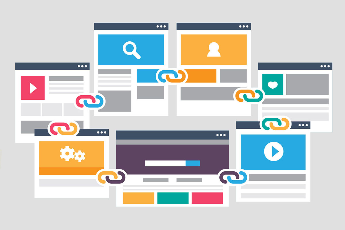
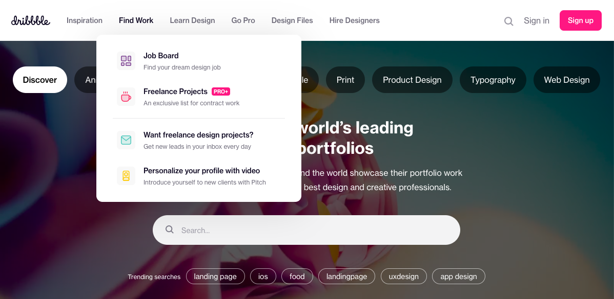
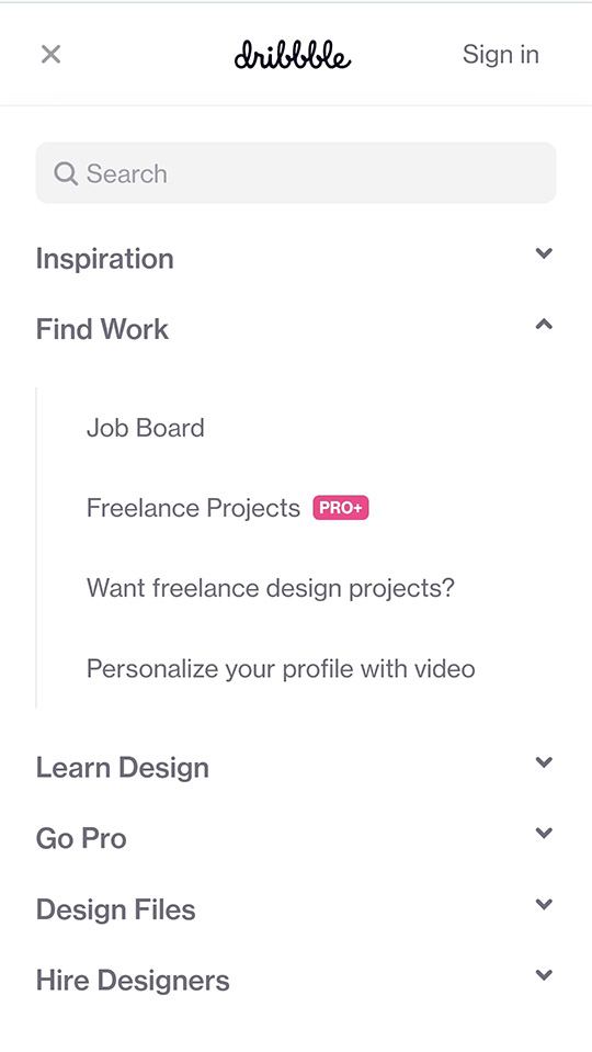
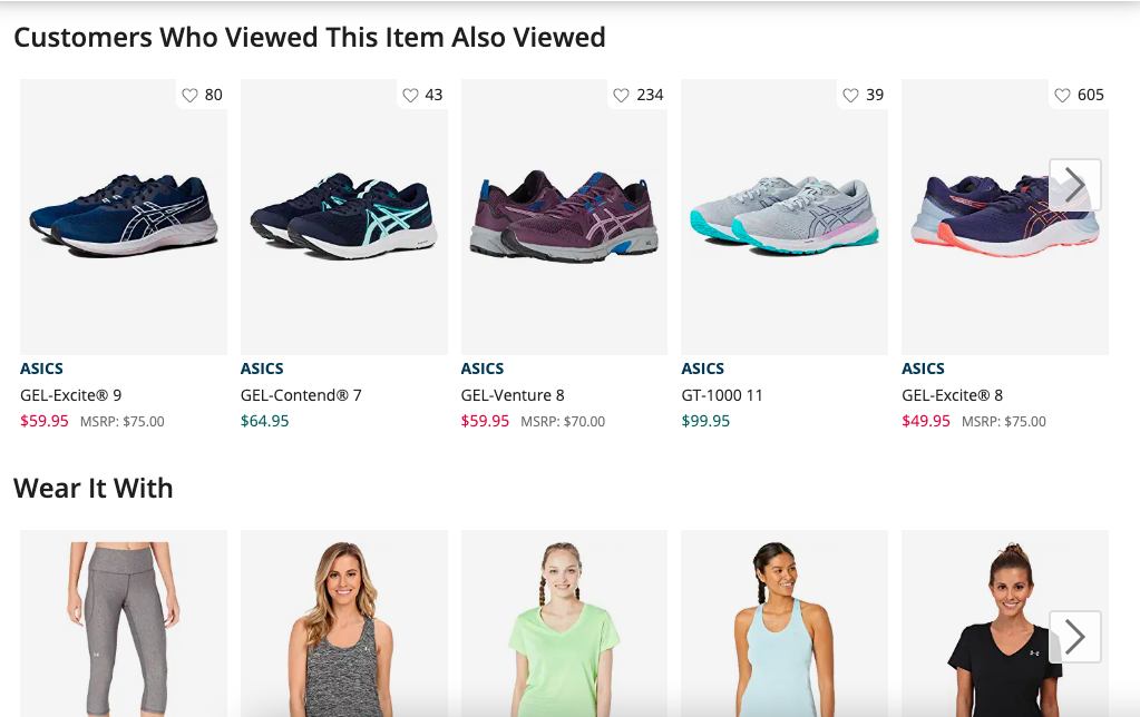
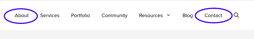
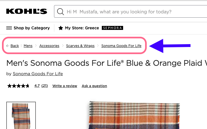
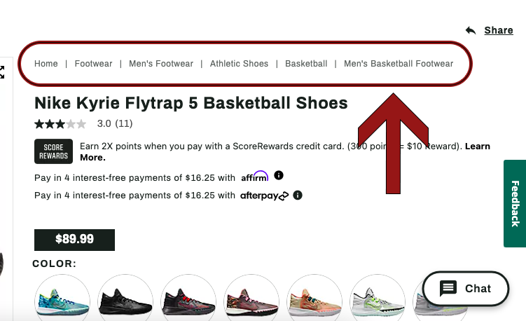
Link as Much as You Can

Users want to be able to click on everything that seems relevant to them like images, headings, buttons, etc. One example would be the items in the user’s cart. While looking at the cart, the user often clicks on it again to view it one more time before placing an order.

Examples of Good vs Bad Internal Linking Practices in UX

We have established a good idea about how internal linking is important in the UX world. Now let's discuss some real-world examples of good and bad internal linking practices from the user’s perspective.

Good Practice: Amazon.com

I was going to purchase a slipper on Amazon when I noticed that I had already purchased it in the past. I do not remember; it was more than a year ago. Amazon not only gave me that info but also included a link to my previous order. I clicked on it and saw that I had returned that slipper because it wasn’t comfortable. This simple SEO practice saved a lot of time and resources and indeed provided a great user experience.

Internal link of a past order

Bad Practice: Dsw.com

A user cannot click on an item in the order history on the DSW website. It offers a bad user experience, users often like to go back and see what they have ordered in the past, and sometimes they just want to look at the product again. The user seems stuck when he cannot click on the link of the product he has purchased in the past.

Photos and Titles are not clickable

Feedback Link Mobile - Bad Practice

DSW offers a feedback hoverable tab over the mobile screen. Mobile screens are small, and you accidentally touch the feedback button every time you scroll down.

Hoverable feedback tab on desktop
Hoverable feedback tab on mobile

Feedback Link Mobile - Good Practice

Kohl offers a feedback button on the desktop website but doesn’t offer it on the mobile screen which makes total sense for a user. They offer it in the footer section so if a user needs it offers a good user experience.

Hoverable feedback tab on desktop
No Hoverable feedback tab on mobile

Breadcrumbs Good Practice - Dickssportinggoods.com

Dicks Sporting Goods offers a dense and detailed trail of links that can take you directly to the category. Each breadcrumb offers a unique link that takes you to a particular page with a filter.

Breadcrumbs links

Similar items link good practice - Target.com

While looking at a product, Target uses several links for the user to get them engaged and the user is most likely to click on any of these and will spend more time on the website. They show frequently bought together items, your related views, more to consider, similar items, and featured products that offer a lot of relevant products a user is interested in.

More products links